CurioXR: Educational VR
Role: Product Designer
Timeline: June-August 2023
Tools Used: Blender, UI Prototyping, Photoshop, Meta Quest
The Creative Brief
The best virtual reality experience requires an easy-to-use, intuitive, and responsive interface.
A clogged virtual reality interface reduces the opportunity for a seamless user experience.
Goals
The goal is to address an inefficient usage of space through the testing and refinement of item placement, improved economy, and creative organization.
Art Direction & Visual System
The design approach resolves core UX friction, specifically clogged interfaces and poor spatial usage. By sketching prototypes and managing design tradeoffs, the process tackles complex UI challenges.
Small, impactful improvements, like increasing padding by 20%, declutter dense menus to create highly functional educational tools.
Craft & Production
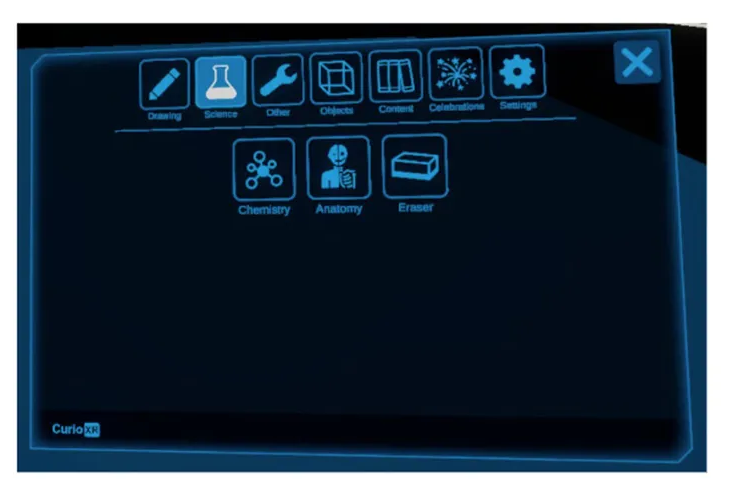
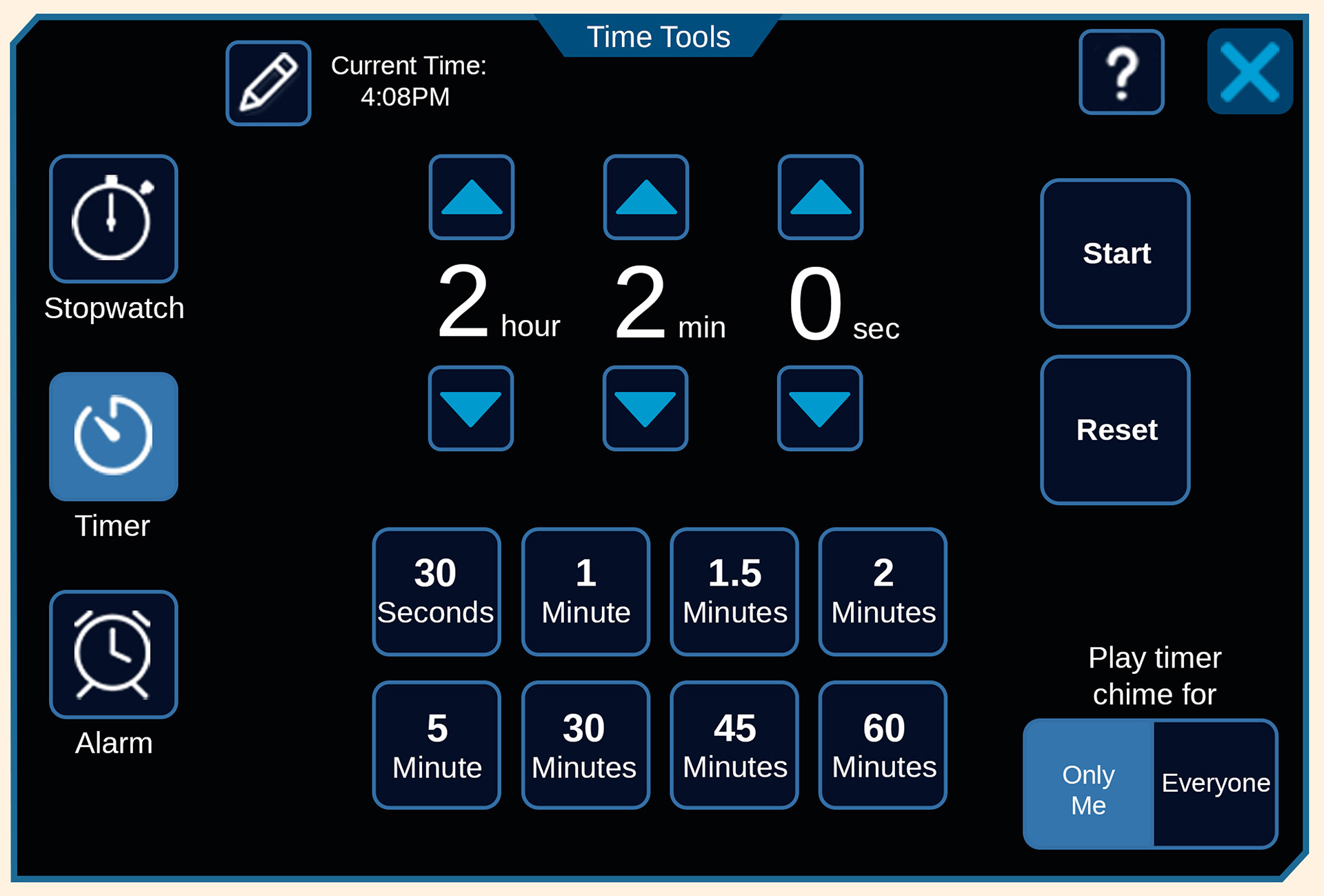
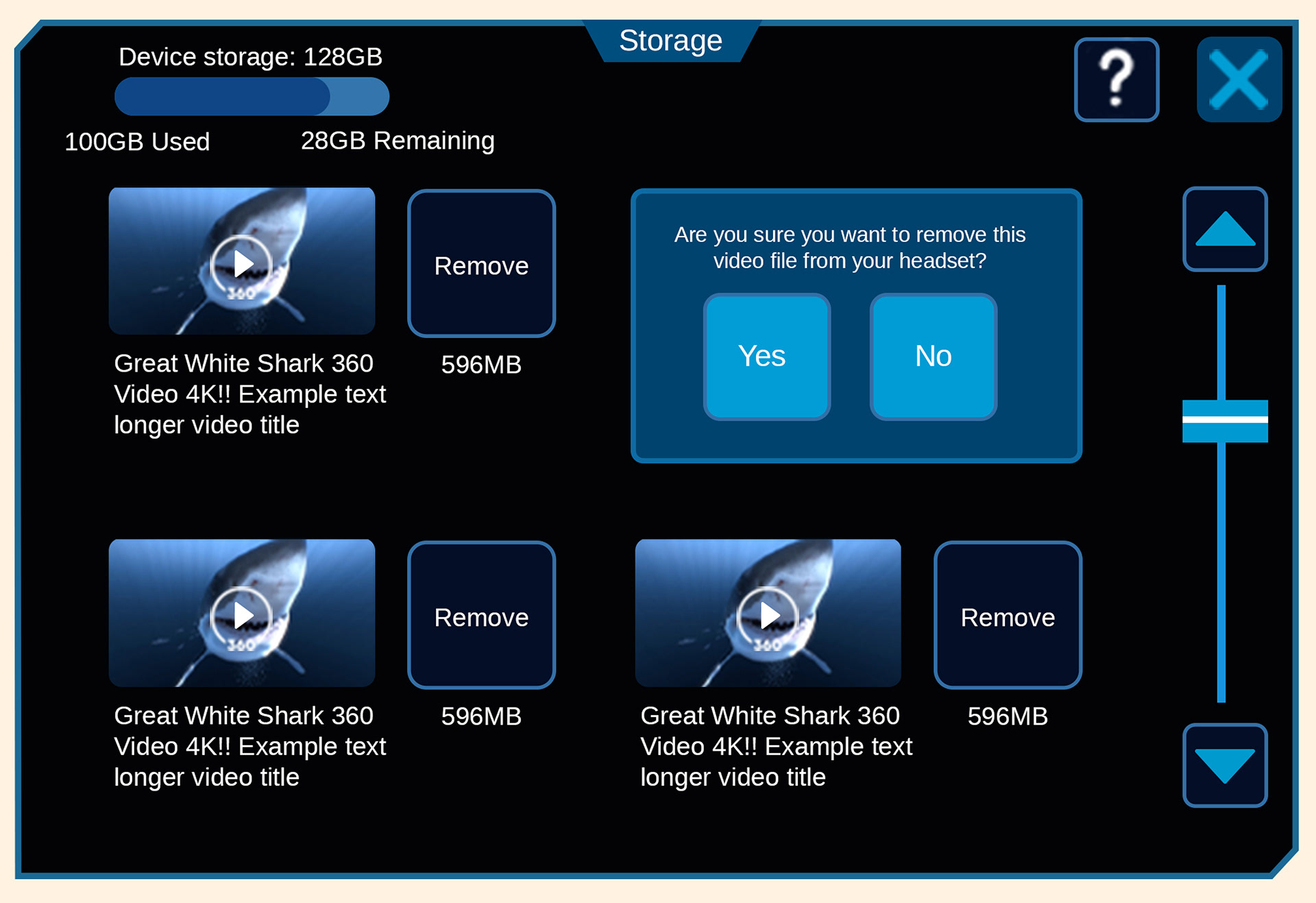
I developed spatial interfaces through collaboration with other product designers for the virtual reality app CurioXR and implemented a design revamp of numerous interfaces of the tablet (Molecule Shapes, Anatomy, Chemistry, Line, Storage, Study Buddy, and Time Tools).
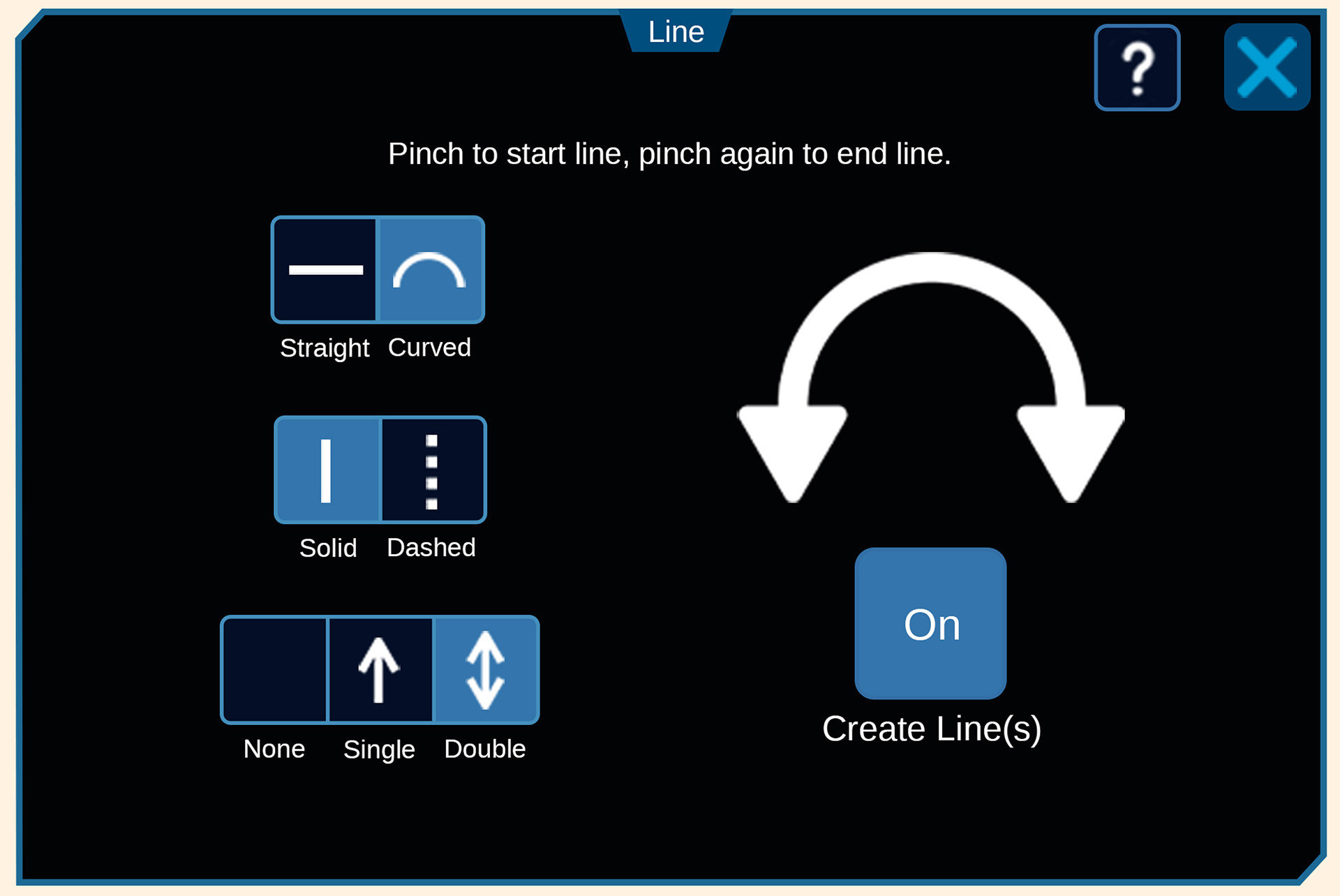
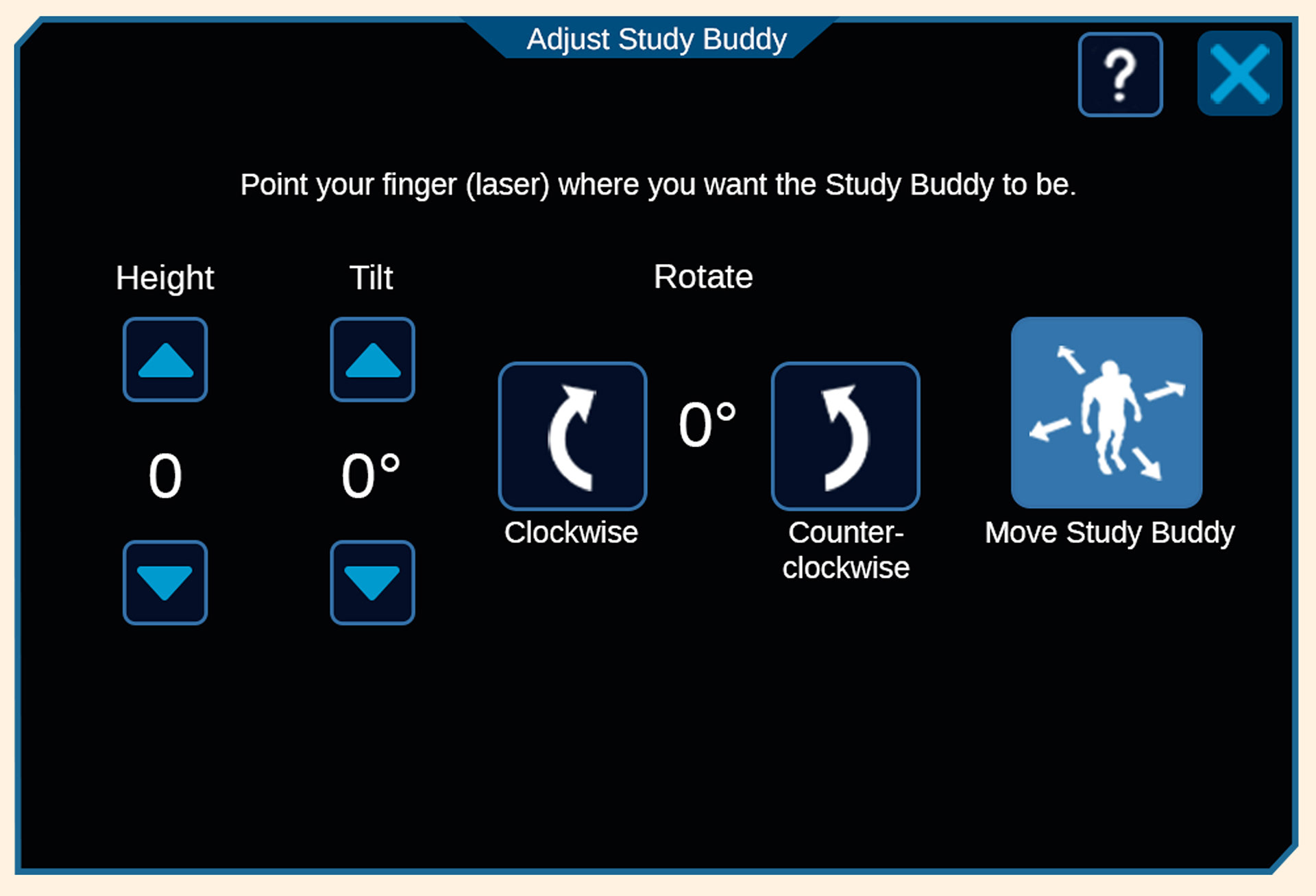
Establishing a standardized pipeline for button templates allowed us to rapidly convert low-fidelity wireframes into highly functional 3D spatial UI.
Main Tablet - I optimized space to spawn interactive 3D virtual elements.
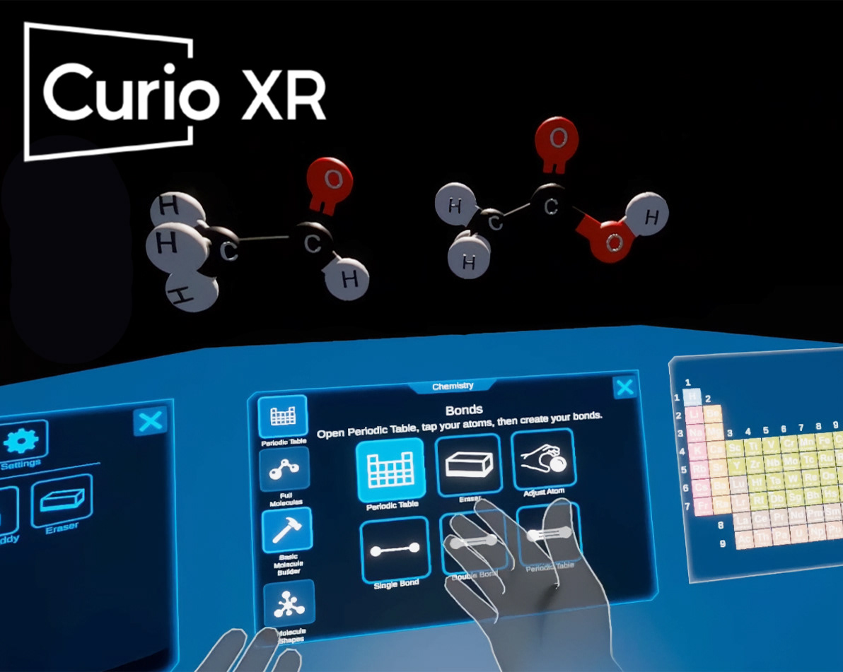
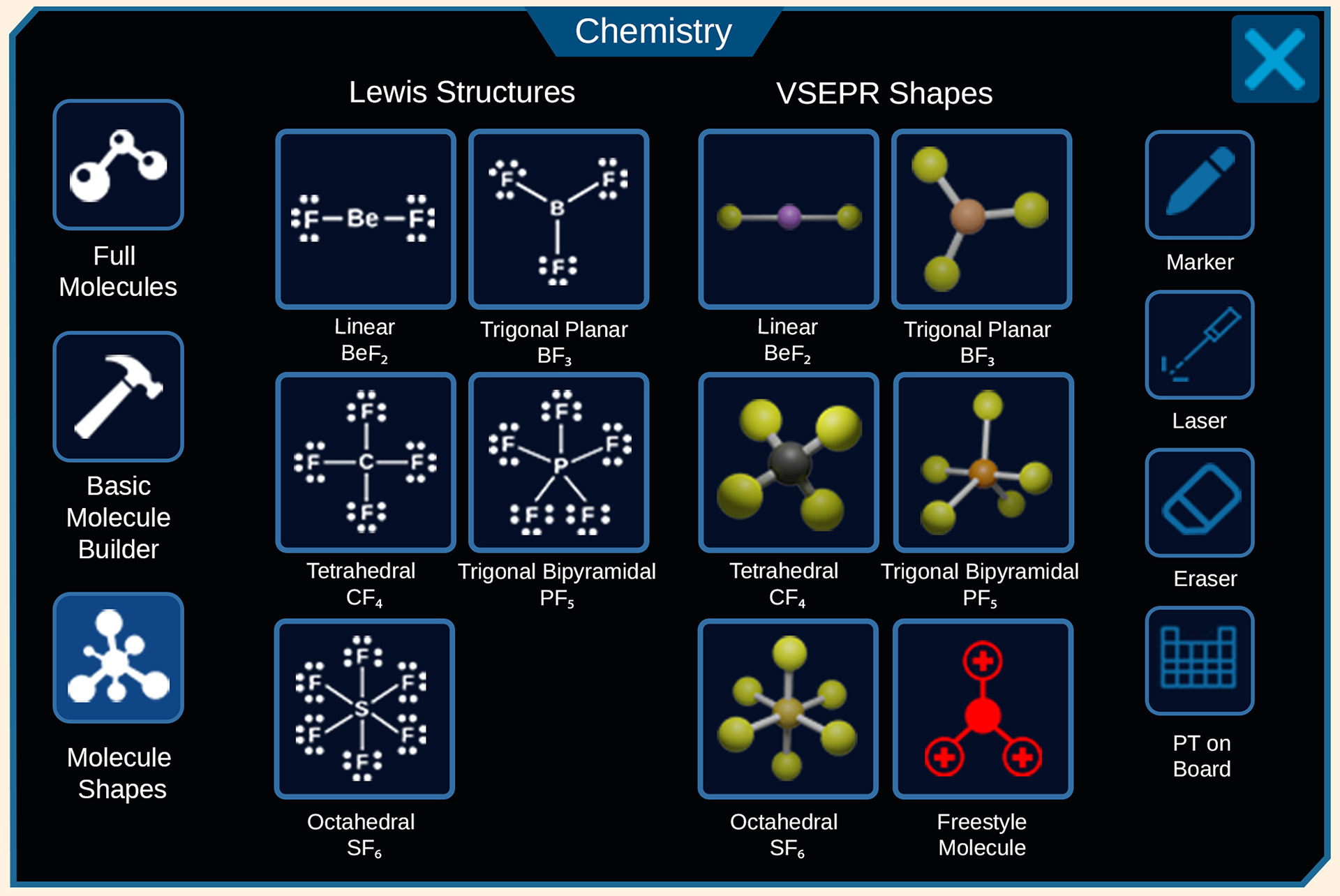
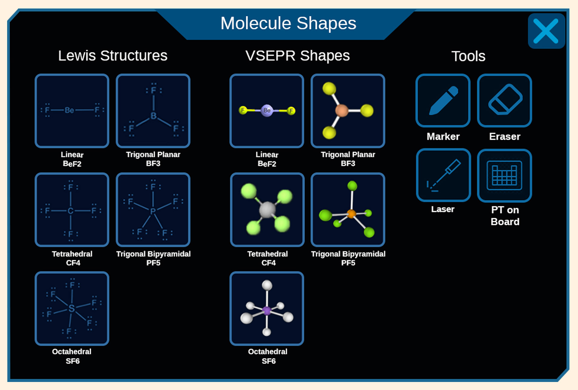
Chemistry Feature Tablet - Subject dashboards developed from wireframes into functional 3D UIs.
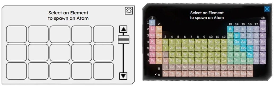
Interactive Periodic Table - The design intent included reducing space and leveraging shared asset templates.
Build Process
Inside Wrist Button
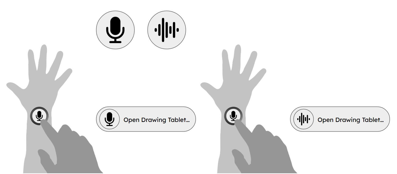
Designing the tablet’s interface also required developing user-focused VR functionalities such as an inside wrist button.
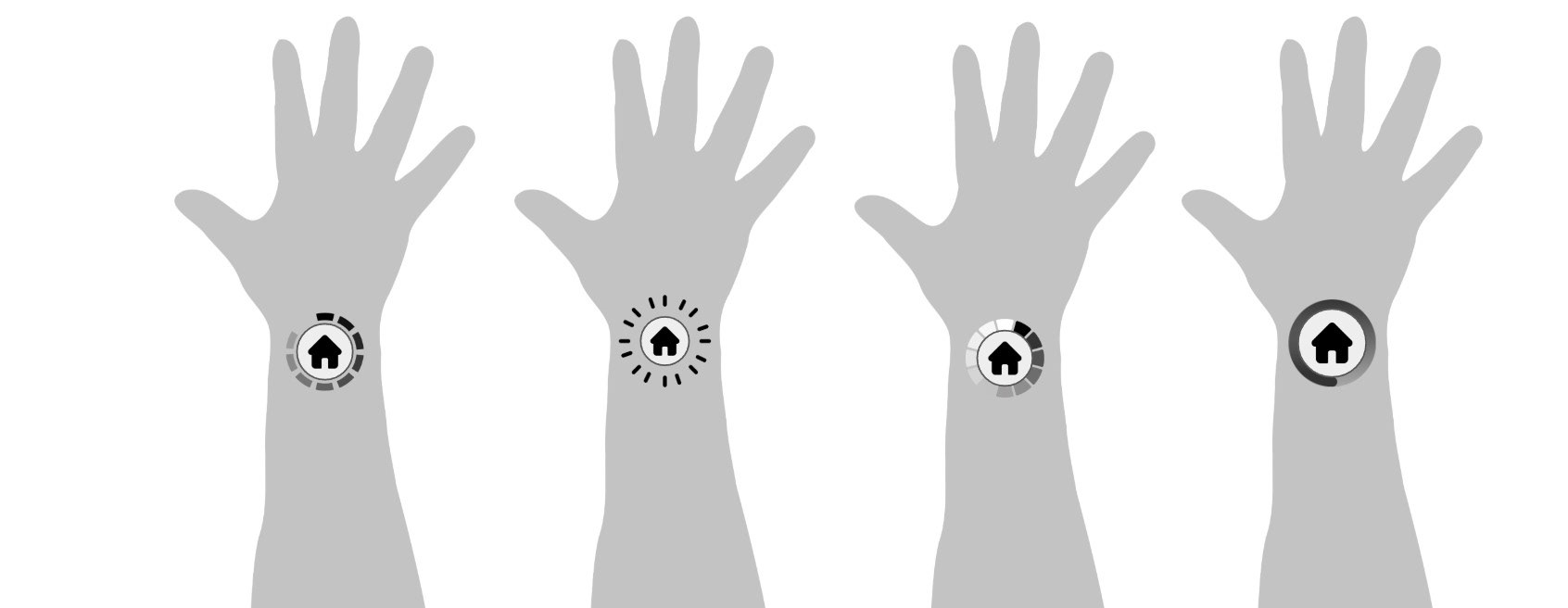
Inside Wrist Button Pressed
An animated wrist button triggers actions with audiovisual feedback.
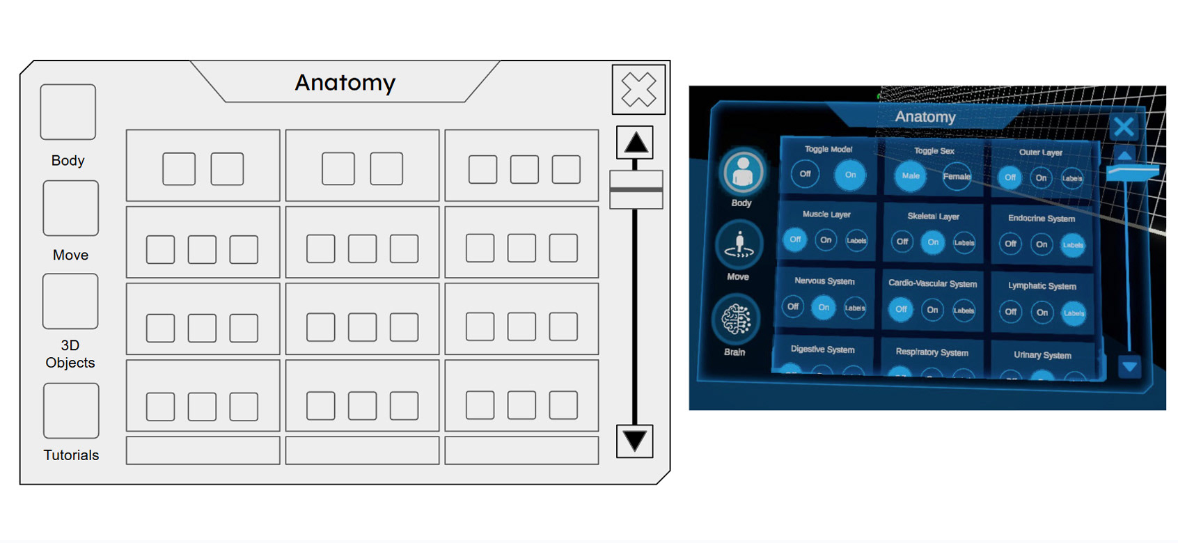
Anatomy Tablet
My designs had 20% smaller buttons and less space between layers, allowing more content to be displayed on-screen.
In-App Experience: Demonstrating the spatial tablet in action. By designing a clean, low-friction interface, users can seamlessly navigate tools to spawn and interact with 3D educational elements, like these proportionally accurate atomic models.
Consolidated 3D spatial models and utility tools into a standardized tab hierarchy, reducing visual clutter and prioritizing the active learning canvas.
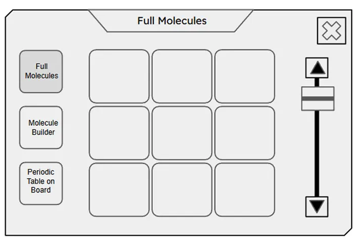
Modeled all the Molecule Shapes in Blender 3D, posed and rendered them for use in-app.
Standardized UI components, padding, and typography across utility dashboards to create a predictable, low-friction user experience.
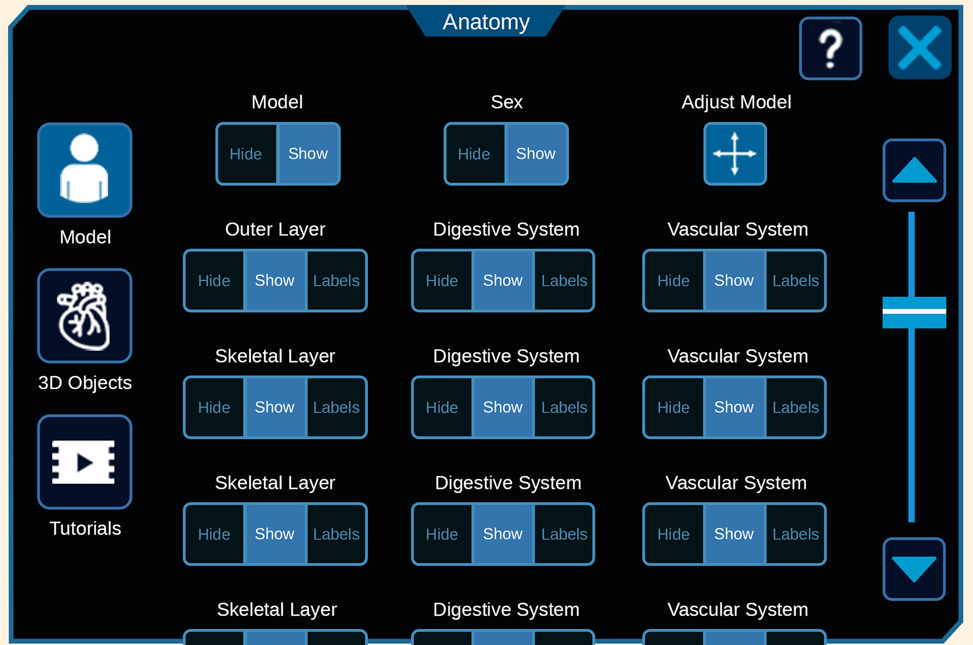
Decreased button scale by 20% and grouped anatomical systems logically to eliminate interface fatigue and optimize spatial usage within the VR headset.